TUNE-IN
MOBILE APP
-
User research and feedback
-
Market research
-
Journey Mapping; Personas
-
Low and hi-fidelity prototyping
-
User flows
-
Heuristic Evaluation
-
Adobe XD

What if we could share the music we were listening to with our friends in real-time?
Overview
"Tune-In" was a user experience project for an interactive music sharing app. Throughout the project, I gained extensive knowledge of user research methods using tools such as IDEO method cards, storyboarding, and user personas and journey maps. Additionally, I learned the importance of creating user flows and visualizing the layout and functionality of each of the major views that a mobile app will have before getting started with creating online prototypes. After creating paper prototypes, I created interactive low-fidelity and high-fidelity prototypes in Adobe XD and had users interact with them while under supervision in order to identify areas of confusion and the general user behavior and flow. Heuristic evaluations were then conducted and adjustments were made accordingly. Overall, this project was extremely insightful, as it opened my eyes to the process of user experience and interaction and how important proper iteration and research is to the final result.
The Problem
Current music-sharing platforms do not lend themselves to collaborative streaming or listening experiences that take into account the tastes of all listeners.
Objective
Design an application that will allow for more collaborative and social music streaming and promote human interaction.
Research Process
Exploring the Problem Space
In order to better understand the problem space, I used several research methods from the IDEO method cards and used them to collect data from my target population of high school to college students.
1
Personal Inventory
Required users to document, name, or list applications on their phone that they felt were most important to them, especially in the social context of bonding or communicating with others. The results were then compared across users with patterns and differences noted. This method allowed me to catalogue evidence of the users' everyday communications and lifestyles and revealed their most valued tools, functions, and features for interacting with others.
2
Day in the Life
Required users to record their daily music listening habits, or essentially, at what times or places they would find themselves periodically or most frequently listening to music throughout the day. This method was useful for my project, as it allowed me to pinpoint the settings or situations in which people found themselves listening to music most.
3
Conceptual Landscape
Required users to either physically or verbally diagram, sketch, or map out what their ideal music-sharing platform would look like and what features they would or would not wish to see. This helped me to understand user preferences when it came to music sharing platforms, and the current successes or pain points of music streaming platforms as they exist right now.
Deliverables
Storyboarding
With the data collected from informal user interviews and the user research methods listed above, I was able to develop several storyboards outlining potential current problems and future solution scenarios. Flip through the gallery to see all the scenarios.
User Persona and Journey Map
Another set of deliverables I was able to create from the data collected were a user persona and a user journey map. The user persona encapsulates the motivations, frustrations, and behaviors characteristic of a target user of the application. The journey map walks through a user's interactions and corresponding emotions with a current music streaming interface in order to identify pain points and needs.


Design Process
User Flow
Once I had established the target user's motivations, pain points, and goals for music sharing, I began to map out the various screens and features that the app would contain to get a visual of how the app would function and flow.


Main Screens
After tentatively defining all of the features and screens of the app, I sketched paper versions of all of the main app screens to visually map out where things should be placed. I sketched screens for the Sharing, Profile Viewing, Chat, and Preferences views.


Paper Prototype
In order to test the effectiveness of my design, I created a paper prototype of my main app screens and gave them basic interactive functionality using Adobe XD. I then conducted usability testing with several participants using this paper prototype, noting where users became confused or got stuck, and what features they found intuitive or enjoyed.
Paper prototype screens with basic app elements


Digital usability test walkthrough with paper prototype
Iterative Design Process
01
Ideate
Develop ideas for solutions based on data from user testing, research, and needs assessment.
02
Prototype
Bring the ideas to life through design and create interactive prototypes that convey the idea's main elements.
03
Feedback & Test
Test your designs with target users to identify pain points, confusion, and issues that must be addressed.
Hi-Fidelity Prototype
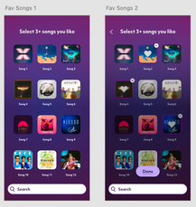
After several rounds of iteration with the paper prototypes, I was ready to move on to more hi-fidelity designs in Adobe XD. Below is the process and progress I made with developing my final app deliverable, testing and adjusting the design along the way.


