top of page
VERITAS ALTA DASHBOARD
-
User research and feedback
-
Competitive analysis
-
Storyboarding
-
Low and hi-fidelity prototyping
-
User flows
-
Presentation/pitch skills
-
Teamwork + collaboration
-
Sketch

How can a dashboard display information in a customizable manner?
Overview
As part of my experience as a Customer Experience Design Intern at Veritas Technologies LLC., I was tasked with exploring the potential for customizability of the ALTA dashboard, which is responsible for displaying all of the customer's data about reports, failures, and other valuable data protection information in one centralized location. Through this experience, I was able to learn about collaborating with a team, presenting my ideas in a convincing way by presenting to 70+ UX design professionals globally, and turning ideas and needs into conceptualized designs.
The Problem
The current ALTA dashboard experience is quite static and can hinder the efficiency of a user's workflow by displaying irrelevant or overwhelming amounts of information.
Objective
Design a dashboard experience that will allow for increased customizability and personalization and prioritize efficient access to the most necessary data.
Current State
After examining the current dashboard design, the main pain points were that the dashboard is overwhelming, static, and hinders efficiency.

Preliminary Research
Defining a Dashboard
Before coming up with potential solutions to the problem, I had to better understand what a dashboard is and what functionalities it should deliver to a user. Keeping this in mind, I began my research both by interviewing coworkers and clients and conducting a competitive analysis and developed a list of traits of what a dashboard should be and what it should not be.
From "The Big Book of Dashboards":
“A dashboard is a visual display of data used to monitor conditions and/or facilitate understanding.”
A Dashboard Should Be:
A Dashboard Shouldn't Be:
-
A clear, direct representation of relevant information
-
A means of easily/efficiently achieving goals
-
A structured, hierarchical, and understandable arrangement of data/KPIs
-
An easily navigable home base that can facilitate further investigation/action
-
Understandable at a glance (five-second rule)
-
A user trying to find information on a dashboard should be able to within ~5 seconds or it isn't efficient enough
-
-
A dumping grounds for all remotely related information
-
An obstacle to move past in order to reach important information
-
A visually cluttered or overwhelming display of data
-
A static, one-size-fits-all information display
Storyboard
After coming up with some guidelines for the nature of a dashboard, I wanted to depict a scenario demonstrating the problem space and potential for solutions. I did this by creating a simple storyboard.

Capabilities of a Successful Dashboard
In order to begin ideating features and capabilities of a customizable dashboard, I collected user input and competitor examples. Here are some of the key takeaways of this ideation.
Adjustable widget sizes/how much information is displayed
Standardized widget functionality (share, download, etc.)
Ability to reorder widgets according to priority; pinning widgets
Ability to add/remove cards from a wider existing widget library
Actionable widgets (take user to relevant information if clicked)
Ability to create custom widgets using filters; add parameters or thresholds
Recently or frequently visited widgets section
Make the customization features clear to the user
Clean, minimal design
Competitor Features
Another method of ideation solutions I employed was a comprehensive competitive analysis of competing companies in the industry, including Microsoft Azure, Salesforce, and more. Below are some of the key takeaways from each product.

Apple IOS and Encompass key features and successes

Apple IOS and Encompass key features and successes
Designing Mockups
Feature Ideation
Taking a screenshot of the existing dashboard experience, I added callouts using Balsamiq and listed potential features that would be feasible to implement in the places I envisioned them fitting best.

Low-Fi Mockups
After deciding what features were most important to conclude, I began to develop low-fidelity wireframes of the dashboard design using the basic shapes and graphics in Balsamiq.

Hi-Fidelity Designs
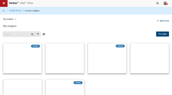
After several rounds of iteration with low-fidelity prototyping, I was ready to move on to more hi-fidelity designs in Sketch. Below is the process and progress I made with developing my final dashboard deliverable, being sure to test and adjust the design along the way and focus on functionality rather than content, as recommended by my manager.

That's all, thanks for following along!
bottom of page


