
WORK

STANDOUT WORKS
TUNE-IN USER EXPERIENCE DESIGN
-
User research and feedback
-
Market research
-
Journey Mapping; Personas
-
Low and hi-fidelity prototyping
-
User flow
-
Heuristic Evaluation
-
Adobe XD
"Tune-In" was a user experience project for an interactive music sharing app. Throughout the project, I gained extensive knowledge of user research methods using tools such as IDEO method cards, storyboarding, and user personas and journey maps. Additionally, I learned the importance of creating user flows and visualizing the layout and functionality of each of the major views that a mobile app will have before getting started with creating online prototypes. After creating paper prototypes, I created interactive low-fidelity and high-fidelity prototypes in Adobe XD and had users interact with them while under supervision in order to identify areas of confusion and the general user behavior and flow. Heuristic evaluations were then conducted and adjustments were made accordingly. Overall, this project was extremely insightful, as it opened my eyes to the process of user experience and interaction and how important proper iteration and research is to the final result.


MDST - MOBILE MODEST FASHION APP
-
User research
-
Market research
-
Wireframing
-
Ideation
-
Figma
In the "MDST - Mobile Fashion App", I learned the importance and intricacies of the process from ideating to eventually prototyping an application for a modest fashion app. As a Muslim, I consider modest dress to be an integral part of my identity, but I do not want the current modest options to hinder me from dressing fashionably. Thus, I came up with the idea for an app that allows a user to upload a photo of an outfit or article of clothing and, using color recognition software and data scraping, the app will provide links to hijabs that would match the selected outfit as well as suggesting potential layering pieces and filtering through immodest clothing options from popular clothing sites by detecting how much skin the model or wearer is showing. The process of creating this application is still an ongoing one, but I have learned an immense amount already from conducting user research and surveys, generating potential scenarios and design needs for target users, and wireframing several of the main screens of the app.


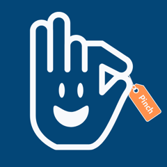
PINCH APP REDESIGN
-
User research
-
Market research
-
User Flow
-
Visual Hierarchy, Minimalism
-
Sketch App
"Pinch App Redesign" was a commission project for a restaurant coupon app whose developers wanted a design overhaul while preserving or enhancing functionality. After analyzing desirable qualities of competing apps and developing a personal brand identity, I created several wireframes of potential designs for the new app as well as redesigning the logo and creating a more organic onboarding experience and improving the general flow of the app as seen from the user's point of view.


MAP OF THE NORTH SHORE
-
Visual harmony/consistency
-
Visual hierarchy
-
Iteration
-
Visualization of information
-
Adobe Illustrator
"Map of the North Shore" was a project aimed to encapsulate the prime locations tourists should visit when in Hawaii's beautiful North Shore region, from famous food spots to breathtaking views. The goal when crafting the map was to produce an eye-catching piece that used design to blend utility and aesthetic qualities. This is reflected in the map's unique set of iconography and landmarks as well as in the attention to detail such as color scheme, texture, and illustration style.
In using the map, I hoped for people to view it not only as a source of navigation or information, but as a beautiful memento of their trip for them to keep and display for years to come, or even add onto and pass on if they so desire.


CHOLESTEROL INFOGRAPHIC
-
Background research
-
Tone & Mood
-
Data Visualization
-
Information Hierarchy
The "Cholesterol Infographic" was a study in organizing and visualizing information in a manner that is understandable to and appropriate for the target audience. This specific infographic covered the topic of cholesterol, what it is, and how to reduce or prevent its' negative effects on the body through diet and lifestyle choices. Because cholesterol levels and heart health in general are topics that can make many feel uneasy, anxious, or confused, it was a challenge for me to come up with a way to deliver information in a non-aggressive manner while still imparting the seriousness of the situation. Thus, using a lighthearted and hopeful color palette of light blues and colorful accent colors, I was able to lighten the mood of the entire piece. Visual aids such as diagrams, charts, and illustrations allowed me to get my point across and reinforce information, while clearly defined section headings allowed for a streamlined navigation. Overall, I really enjoyed this process and am excited to be able to create something useful that can hopefully encourage others to improve their heart health.

PRODUCT DESIGN WORK
-
Market research
-
User testing
-
Iteration
-
Ideation
-
Ergonomics
-
3D Modeling (Rhino)
Product Design appeals to me because it requires the application of the design process in its purest form, from identifying a problem or a user's need, to market research and prototyping until the final form is born. The projects I have showcased below are an ergonomic handheld potato peeler design and a food-sealer to prolong the shelf life of perishable goods.
Through both projects, I learned the importance of iterative design and learning from mistakes or setbacks in order to improve the final model. I also learned a lot about the value of in-person user testing, because there are nuances about a design that one may not notice until someone holds it in their hands.


ES DEVLIN EXHIBITION DESIGN
-
Condensing information
-
Curating an immersive experience
-
Developing brand identity
-
Human-centered design
-
Adobe Illustrator, Photoshop
"Es Devlin Exhibition Design" was a project in which I designed a museum exhibition timeline wall for renowned British stage and set designer, Es Devlin, who has worked on sets for the Olympics, Coachella, The Super Bowl, Beyonce, Kanye West, and many more, and whose work I admire greatly. This was my first attempt at working on visual design at such a large scale, with each section of the timeline taking up an 11' high and 25' wide wall. Using motifs from her work such as black, red, and cubic forms, and mimicking her affinity towards breaking the mold and leaving a lasting impression on the viewer, I created a timeline that was very moody and intense, with deteriorated, almost electrified type and rapid white sketching that pays homage to her visualization sketches she creates before every one of her projects.
Because Devlin's work is all live, each image square that corresponds to a notable project of hers is designed to be a moving video screen that demonstrates her work in use and in motion, so the viewer may get a better idea of what it would be like to witness the work in person. As the viewer moves around the room, they are able to refer to the static sketch in the background and the title above the screen to get a better idea of what it is they are about to see. The exhibition itself is not too reliant on the sequence in which each project happened, allowing the viewers a chance to roam freely without feeling directed or herded along. A massive cube in the center of the room displays the cover art and artist introduction and reflects the cube motif that appears so often in Devlin's work.


WORDLESS INSTRUCTIONS
-
Visual clarity
-
Simplicity
-
Digital illustration
-
Directive iconography
-
Adobe Illustrator
In this project, I wished to improve my visual language and communication skills by challenging myself to create a clear, concise instruction manual for a specific action without using words. The action which I demonstrated through the illustrated steps was how to easily put on a jacket 'the fun way'. Through different points of view from top-down to front-on, and indicators such as arrows, X's, and different opacity levels, I was able to guide the viewer to the desired action without having to explicitly write out each step.
Through the project, I learned the important lesson of "show don't tell" and also realized that not every piece of information or step of a process is immediately and universally understood, and so it is important to describe processes in a thorough manner as if designing for someone who isn't from Earth and does not know anything about processes or objects here.


SITE SPECIFIC PAPER INSTALLATION
-
Interactive design
-
Material research
-
Site-specific installation
"Site Specific Paper Installation" explored the properties of paper and stretched the boundaries of what paper could be. The project's aim was to create an interactive space that transformed the site it was in and allowed users to gain a moment of peace, inspiration, and joy from a simple disruption of the norm.
Because of paper's organic quality, the installation would only be available for as long as the elements allowed it, and this made it that much more precious to those who did come across it and get the chance to interact with it or see it come to life with a gust of wind.


REDESIGN PROJECTS
I love redesigns because they show how much progress can be made and how much better of an experience one can deliver with a few simple adjustments that transform the entire personality of a webpage or brand. These redesigns in particular involve a mockup of a Zoom Arcade Mode and a wider selection of emotes, and a new logo for a healthcare company, Gappy.


-
User research
-
Market research
-
Iteration
-
Visual design
ANIMATION PROJECTS
While I am fairly new to the world of animation, I have gotten quite familiar with the features available in Adobe After Effects and with rotoscoping techniques in Photoshop, and am particularly proud of these works. The videos I have included below each highlight varying levels of attention to storyline and narrative as well as an emphasis on visual translation and appeal.


-
Motion Design
-
AfterEffects
-
Narrative


